Saturday, January 31, 2009

~ Painting in Progress ~

Supervising the proceedings...

This afternoon, I painted a second coat of Sea Fog on the little dresser.  Then I attacked my driftwood green bookcase.  It's actually a pretty grey-green, but I've grown rather tired of it.
Doesn't it look much prettier with a coat of pale blue paint?  I think it looks smashing!  Tomorrow I'll do a second coat and paint the undersides of the shelves.  
I also dropped by Lee Valley and picked up four glass knobs for the little dresser.  
Come back tomorrow and see if I manage to make some progress.  I am rather weary from a hard yoga session this morning and wish I could take tomorrow off, but I really must get this project done.

My yoga teacher's motto is "Make your yoga practice really hard and then the rest of your life will seem easy."  I could use a little easy right now...

Soon, Terri

Friday, January 30, 2009

Sea Fog

When I saw this cover of "O at Home" (Winter 2008) the other day, I suddenly realized what colour I want to paint my home office furniture.  I want it to be pale blue, like the walls in this serene photo.This space is the perfect incarnation of the colours I want in my home office.  There is the blue and white theme, accented by striped brown and white blinds (I intend to use linen-coloured fabric) and little pops of pink and green and turquoise.

So, I decided to paint my furniture a colour called "Sea Fog" (by General Paint), which I mentioned in a previous post.  This was my first instinct, so it was time to finally commit (I can always change it, after all!).  Like any good engineer, it takes me forever to make a decision while I consider every possible solution, but when I'm ready, it's full speed ahead!

Tonight, I started with the ugly dark blue dresser.  I emptied the drawers and took it apart, removing the old hardware (which I'll replace).
I bought a new tarp to put under everything (my previous tarps were borrowed and have since gone home).  Then I wiped everything down with a damp cloth - the dresser had been stored in the garage, and I didn't realize how dirty it actually was until I started cleaning!  After it dried, I started painting the dresser (for instant gratification) and finished with the drawers.
The colour is very tranquil and pretty, a peaceful baby blue.  
Tomorrow I'll do a second coat, and if I like the way it looks, I will paint the bookcase.  Come back soon to see my progress.  Tomorrow morning after my yoga class, I'll go pick up new knobs at Lee Valley.  I already have my eye on some little crystal ones.

Tuesday, January 27, 2009

I Just Bought

These...
I decided it was time I did something for the economy.  No need to thank me (wink)!  I have been coveting a pair of these boots for several months.  All I saw in Paris in October were riding boots - everywhere!  I have wanted a pair since, and got these beauties on sale (okay, so the trend is likely over in Europe but it didn't even register here, yet!). 

I took English riding lessons for quite a few years (in my late 20's!) and I felt a wave of nostalgia when I put them on - even though they are not quite as high on the leg as my old riding boots, which come all the way to the knee.

These are lovely with jeans and skirts and leggings and even looked good with my glen check wool dress pants today - except it is a shame when you cannot see all of them.  Almost as nice as a new bathtub.

Monday, January 26, 2009

Home Office: Color Dilemma

The exterior colour of Victoria Hagan's New England home inspires my office colour palette
(Photo:  Country Living)
*
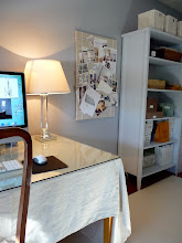
Remember my office?  It needs your help.  I finally replaced the rug with an ivory wool, neutral rug (which I love) from Ikea.  The rug is called Havbro.  But now I want to paint the bookcase and the small dresser to match each other.  I just can't decide what colour to use!
The walls will remain this pretty medium blue, a colour called Scribe from General Paint.
The ugly mouldings (trim work - now brown) will eventually be replaced with more substantial white trim when we re-do the whole house.  In the meantime, I plan to sand it and then paint it white because I really hate it and want it to disappear.
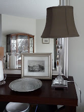
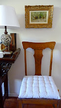
The desk will remain as-is for now (since David won't let me paint it), but may be replaced with my old table (which I can paint).  New curtains will be hung (white cotton on a white wooden rod).  The armchair will be re-upholstered and the desk chair will be replaced (eventually).
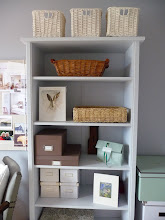
So, my dilemma is in choosing a good colour for the bookcase and the small dresser.  I am torn between three choices:

1. WHITE

White furniture will make the blue-and-white theme very literal.  The white curtains and ivory rug will work perfectly, and I will likely use brown linen colours as accent colours for upholstery and storage containers.  I can also use blue accent colours, including some of my blue pottery.
White cabinet from Biskopsgarden shop

2.  PALE BLUE

Pale blue furniture will make a nice transition from the darker blue walls.  Then I can use white as my accent colour in the curtains, ivory rug, and for all my storage bins and baskets.  I am leaning in this direction because all my accessories can be white, which is very practical.
Blue  cabinet from Biskopsgarden shop (Photo Mari Eriksson)

Here is the exact blue I would use (below).  It is the complementary colour from the General Paint swatch and it's called Sea Fog.  I love the name as it evokes, naturally, the seaside!  I've shown it here against the new rug, which has a lovely weave and is quite soft.


3. GREY-BEIGE or LIGHT BROWN

My third option is to keep the bookcase in the existing grey-beige family.  I would give it a new coat of paint to freshen it up and then paint the dresser to match.  This idea isn't so obvious, but having linen-coloured upholstery would bring it all together.  There are so many beautiful grey-beiges and light browns, and it would create a weathered-driftwood-beach effect in the room.  White accessories would also look gorgeous against a light brown bookcase. 

Some of my colour choices are:

(a) Slipper Satin by Farrow & Ball (shown below on large cardboard):  I think this cream is too light (it's a beautiful pearl cream), but it's the same colour used in the hallway outside the room, so it would relate (and it looks so pretty on my hall walls!)
(b)  Skimming Stone by Farrow & Ball (see below).  I love this gorgeous milky beige and I am hungry to use it somewhere!  It is a perfect beach sand shade.
(c) Baby Fawn by Benjamin Moore.  This is a beautiful pale taupe (and was a Pottery Barn feature colour last year).  It would probably look best with the tone of the blue walls, as it has a similar saturation.  I'm leaning towards this colour if I do something in the brown family.

Now it's your turn - what do YOU suggest?
  
I really need some advice here!
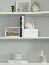
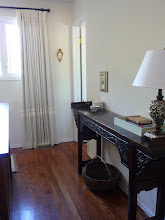
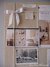

Saturday, January 24, 2009

For the Love of White (with Pink or Blue!)

Domino (I think this is a Ruthie Sommers' bedroom)

Everyone who reads this blog knows I'm mad for all-white interiors.  But reality is far from fantasy and I just can't live without some colour.  If you could see my house, you'd notice that I gravitate to a neutral palette with lots of pale, muted shades.  I have a base of creams and white and ivory and most of the colours I use are greyed-out versions of pink and blue and green - in other words, the "dusty" antiqued versions of these colours.
*
But if I could have a second house, I'd have a lot more pure white with pops of punchy pink and blue!  This combination has a certain spirited and youthful je ne sais quoi that I adore. Maybe because it reminds me of candy?
*
I like pink in all its incarnations...from the faintest rose to antiqued pinks to the hottest hot pink.  I also love the shades of blue, from turquoise to periwinkle to the palest baby blue.  I plan to paint our downstairs bedroom a soft pale blue (Farrow & Ball's Skylight) within the next couple of months.  And I'm planning to incorporate more blue in my office because it's restful and pretty and joyful all at once. 
*
So...I decided to put this post together to showcase some photos I've been collecting that feature little bits of either pink or blue (or both!) with plenty of white.  Hope you enjoy the photos, and isn't it sad that we can't redecorate every month?  
*
A pale pretty pink and white room from Shoot Factory (a few too many pillows perhaps?)

A regal room from Shoot Factory - isn't this dusty hot pink upholstered headboard just delightful, especially with the old wallpaper?

I love the candy pink chair and abstract painting in this modern all-white house (a favorite photo I have posted before from Living Etc.)


A muted dusty pink from The White Company

This all white traditional room is picture perfect with its restrained use of pattern in the pink toile drapes

A little mirror from the Land of Nod picks up the blue-pink-white theme!

A bouquet from House Beautiful reminds me why I love pink...it is most exquisite in the form of flowers

A blue and white living room with touches of pink is perfectly approachable...

Some teacup candles from Martha Stewart let you showcase your pretty pink china...(I love this photo)

Graham & Green tease us with a sliver of hot pink dresser in this photo.

A pink living room from Domino would always be cool in the summer.

Another pink treat from Graham & Green

I love this striped pale blue wall from Arts & Decoration (via Marley & Lockyer).  I fully intend to steal these stripes for somewhere special!

This blue-ish room from Domino has everything I love in a room - high ceilings, giant windows, silky drapes, white furniture and the most beautiful hot pink pillows I have ever seen!

Another whimsical photo from the Land of Nod, with a perfect combination of sweet colours against a sea of white.

Another gem from the White Company - an all-white room spiced with pretty pink

A white & blue & pink room (with green!) from Pottery Barn Kids (some of the best ideas come from children's stores) - isn't the pink rag rug just the prettiest?  And I'm coveting those exquisite butterflies! 

More whimsy from the Land of Nod - all my colours in two soft toys!  Maybe what I really need is a baby!!!

Friday, January 23, 2009

Domino Magazine Subscription Winner

Hello dear Readers!  
*
The winner of the Domino magazine subscription giveaway is:
Blue Muse 
*
Blue Muse (Isa) has a wonderful blog called The World According to Isa that you definitely must visit.  Isa's gentle and spirited site is brimming with beautiful music, incredible photographs, gracious quotes and tons of inspiration!
*
Please visit her and leave her a word of encouragement as she and her partner undertake a wonderful  reno project of their lovely beach home and guest cottage.
Thanks to all who took time to enter and leave your comments!
*
As for me, I am busy with a new yoga class on Saturdays and a Photoshop class on Wednesday nights, so my plate seems rather full all of a sudden.  Please check back as I will try to post soon.  
*
Love Terri xo
*

Sunday, January 18, 2009

Home Office Inspirations

Now this is my idea of a home office.  It's especially great for those hectic days when you need to sign the cheques for all your servants and look at your decorating magazines.  Some folks have such a hard, hard life!
Photo:  Shoot Factory

Sadly,  I suspect that your home office doesn't look like this.  I know mine doesn't.  Regular folks have offices that look more like the room below (or not, but at least this is the realm of possibility!)  With a simple Parsons table (say, from Ikea), you're off to the races.  This wee office has lots of storage and the open-backed bookcase serves as a room divider while still letting the light through.  I think this idea is brilliant, since offices are often stolen spaces in other rooms and privacy is king.

I really like this Martha Stewart office wall idea (below). This is a novel twist on the plain vanilla office chalkboard!  With a lot of painter's tape and patience (and Valium), this amazing wall can be yours very inexpensively!  I just love Martha.

This is a picture-perfect office for me (below) - all white and nothing out of place.  But sadly, this just isn't my reality.  I would need a lot of bins and baskets and drawers to keep this serene space looking stylishly uncluttered, but I still love it.  See, I really do have some modern genes.
Photo:  Living Etc.

In this handsome office (below), I don't love the furniture, but I like the arrangement - with a big side table for staging and sitting stuff.  I'm finding that a large side table is vital in a home office for transitional papers - the more surfaces, the happier I am.  But what I loved most about this room was the artfully-arranged vintage photography collection, whose framing and style belie the modernity of the room.  The photo collection takes this room from generic to chic-unique!
Photo:  Living Etc.

This office (below) is the cat's pyjamas in my book, in terms of ingenuity.  You don't need a ton of space - just one long wall to install a big slab o' desk!  This idea is pure genius, and it looks utterly amazing in front of a big graceful window.  Practical and simple, and elegantly executed!  And the glossy spring green makes my heart go ka-thump!
Photo: Living Etc.

I like the wee office below, as it appears to be tucked in behind a headboard or other room divider.  You don't need a ton of space if you have a laptop!  It looks like the owner used a small table and flanked it with two simple storage units to yield more surface area.  My favorite thing in the room is actually the clear Plexiglas file holders (to the left of monitor) - does anyone know where to source these?  I also like the big shallow bowl for newly-arrived mail.

This office (below) is super-clever if you're building from scratch - as in kitchen design, a long, galley style office is a great use of space.  I would do all closed cabinets on the bottom (except for the kneehole of course) and all open on top for display and photos. 
Photo:  Source Unknown (House & Garden?)

Next is a typical home office which I've included because it makes great use of space (an extra table for the printer always helps unload your desk) and I really liked the little shelf next to the bigger shelf.  Corkboards are also de rigeur for your magazine clippings and postcards!
Photo:  Cottage Living

Modern shelves never cease to please.  I think home offices make great display areas for family photos and an ever-changing collection of eclectic art.  Give yourself lots of shelves and surfaces for your art collection and your photos.
Photo: Source Unknown

This is a dining room (below), but I just adored the shelves and think this would work equally well in a home office.  Heck, there's no sense having one shelf when you can have six.  Stack 'em to the ceiling and show off your collection of thingamajigs. 
Photo: Apartment Therapy (Anastassios Mentis apartment)